Are you eager to see what is in store for 2019 as it relates to website design trends? What is it that dazzles you when you first land on a page you have never been to before? Is it the use of colour? Simplicity? Movement? We know that the world of website design has changed vastly over the last few years, so much so that it is virtually a competition to show off the latest and greatest in design much akin to the fashion runways of Paris. If you want to stay ahead of the curve as we move into 2019, you will need to pay attention to the top trending elements that will keep your website fresh and exciting. Have you ever heard of the expression that a fish has an attention span of about three seconds? Well, take that and apply it to the general population. Think about it. When you are searching for information online, and you click on a site that is taking “forever” (3.5 seconds or more) to load, what do you do? Let me speculate the answer – you likely go somewhere else. What does that mean for your business? Speed is going to be a massive factor in the coming year. One important aspect of Google’s ranking system is page load time, and they will not be the only search engine to rank this way. Pages that take more than three seconds to load will eventually be overlooked. Sad but true. What does that mean as it relates to the overall design of a page? For starters, pages that used to be image-heavy with little “white space” will now incorporate more negative spaces or areas on the page with no graphics or copy. Engaging colours with simple images will draw surfers in and hold their attention with speedy loading times on both desktop and mobile devices. Speaking of colour – remember the 80’s? Colours of the future will be reminiscent of the past. Think in terms of moody blues, minty greens, plucky peaches, swanky salmons, and passionate purples that have high saturation levels and draw the eye in. Many of us are familiar with websites that are navigated by a menu, also known as the traditional hierarchical layout, which takes us to different pages within the site. More and more sites are now moving toward the use of a single page, thus keeping the visitor from being distracted and with the obvious goal of funneling them toward a sale. Businesses are also better able to capture sales leads through opt-ins this way. If you are a designer, you will understand the use of grids for layouts keeping everything neat and evenly spaced out. However, we now will begin to see those grids taking on an asymmetrical style. Asymmetry, coupled with the use of white space and shapes such as basic triangles, circles, and squares, will be what seizes the attention of 2019 web surfers. Why triangles, circles, and squares? Simply put, Psychology.
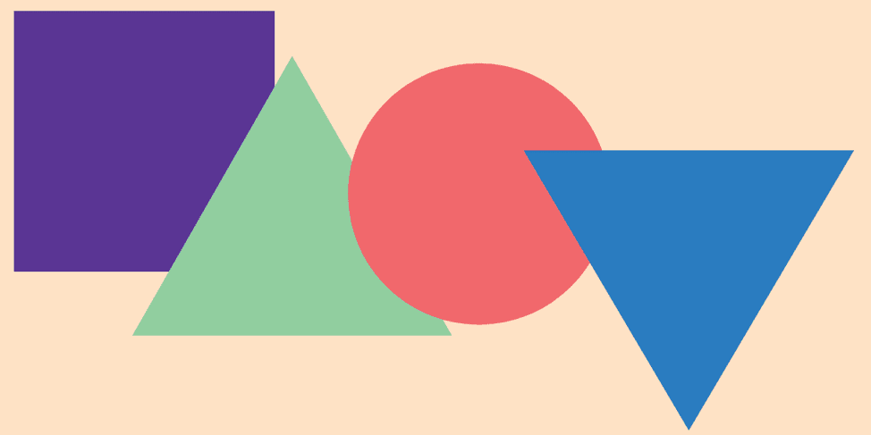
Shapes often represent ideas and feelings. In general, triangles represent two forms of thought, depending on whether the triangle is pointing up or down. A triangle pointing up can represent power and direction, whereas a triangle pointing down can suggest instability. Circles represent wholeness and harmony, while squares suggest order and stability. What feeling do you want to invoke in your visitors? Humans are creatures who require instant gratification to keep us content, and that is where micro-interactions will come into play. Just exactly what are micro-interactions? Micro-interactions are generally animations that may require the viewer’s input or interaction. They can come in the form of animated buttons, calls to action as well as status updates when an action is being performed. Along with instant gratification, we love to be entertained. How much more interesting have social platforms become since the inception of live videos? Websites are no different. Site visitors are not only appeased by the correct use of bright colours, gradients, and the use of white space; they also love to see movement, and more specifically, background videos that have proven to increase overall conversions. The site visitor is entertained, feels good about the product, and therefore stays on the page longer, which often results in the desired outcome – a sale.
With the use of more minimalist style photography, those selling on their sites can provide a clear and concise product without the superfluous fluff that can distract from the end goal. If you were to think in terms of television and the theatres, one of the bigger developments has been the use of 3D. 3D draws the viewer in like nothing else and makes them feel as if they are part of the show. And like television and the movies, retailers are adopting this way of reaching their customers. By drawing a customer in and making them feel a part of their product, they connect with the product and think in terms of it being their own. By using a key element known in the design world as drop shadows, graphics direct the viewer’s eye toward the product and draw them in much like the use of 3D with the difference being that no special glasses are required. In terms of fonts: look out for extra-large lettering. All in an effort, of course, to get attention. On a final note, be prepared to offer the viewers to your site the best quality in graphics. While this seems to go without saying, this is more important than ever, as there seems to be an influx of site visitors who opt to print a shot of what it is that you may be selling or featuring on your site. Why so? Despite our ever-growing digital world, and the use of cell phones and tablets, people are not yet ready to do away with the concept of print just yet. Our phones are small, and we are forever on the go. What better way than print to share the idea of what it is we want to buy with a friend or to save information to view later? Are you ready for what is in store in 2019? Do you feel that your site could use a boost? If so, reach out!