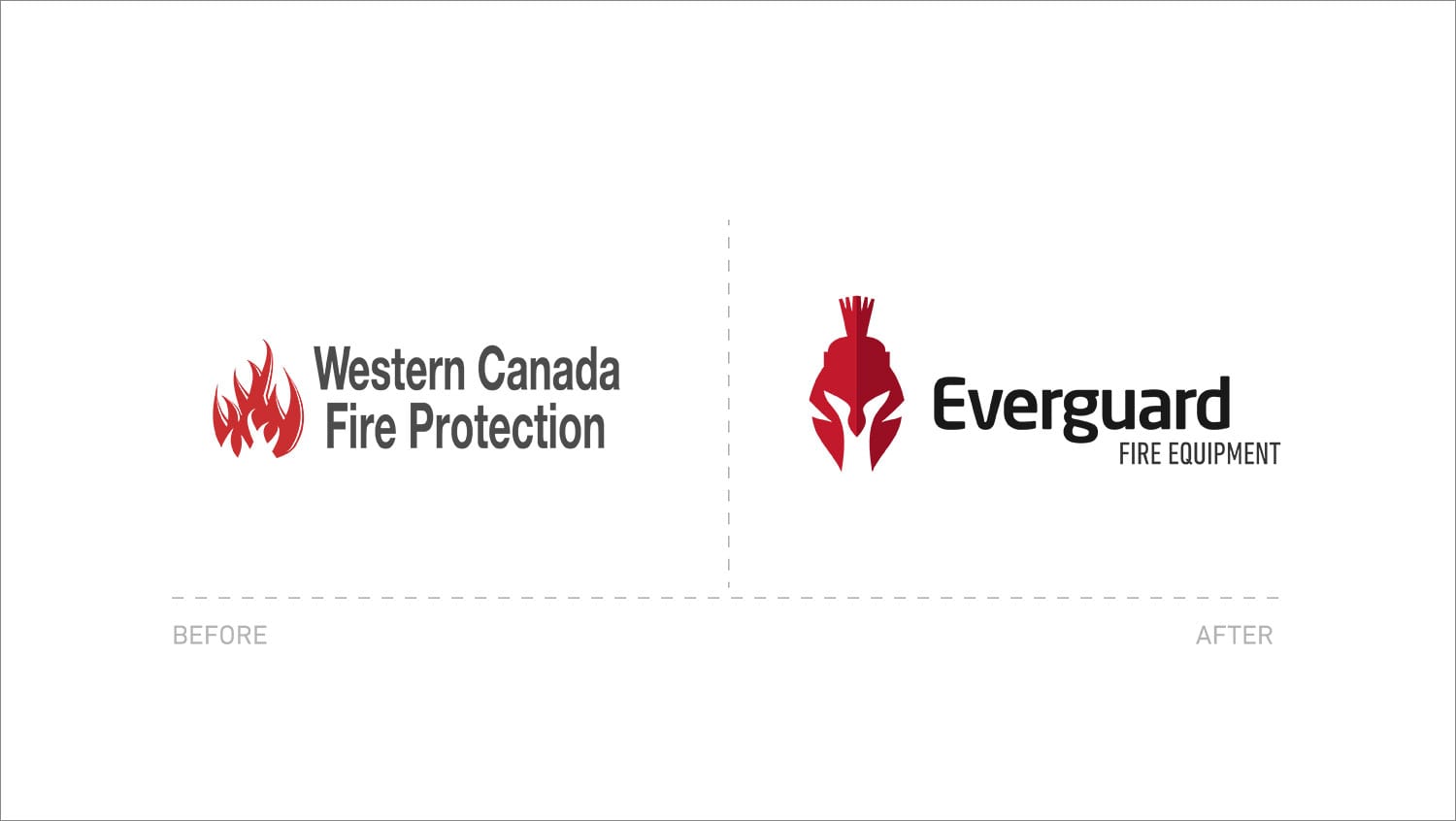
Western Canada Fire Protection came to Thrive needing a change. The company was associated with other independent companies in locations across B.C., and the new owners wanted to create separation and build a brand that aligned with their values and vision.
The process started with creating their brand platform and a new name. We wanted to create something that sounded personable yet still evoked a sense of trust and reliability.
Having interviewed many of their clients and staff and heavily researched their competition, we arrived at the following that not only resonated with the client but was core to their beliefs:
WHAT
Fire equipment sales and service
WHY
Safety of clients’ investment(s) and the lives of their employees and tenants
HOW
• Quality product and manufacturers
• Passion
• Trust / Honesty
• Integrity
This What, Why, and How was then expanded into their introduction conversation:
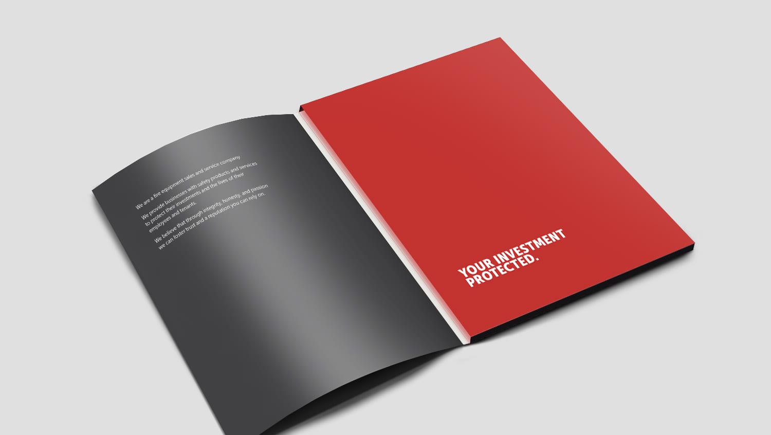
“We are a fire equipment sales and service company. We provide businesses with safety products to protect their investment(s) and the lives of their employees and tenants. We believe that through integrity, honesty, and passion, we can foster trust and a reputation you can rely on”.
We were able to condense the company’s essence (a few words describing its fundamental nature) to:
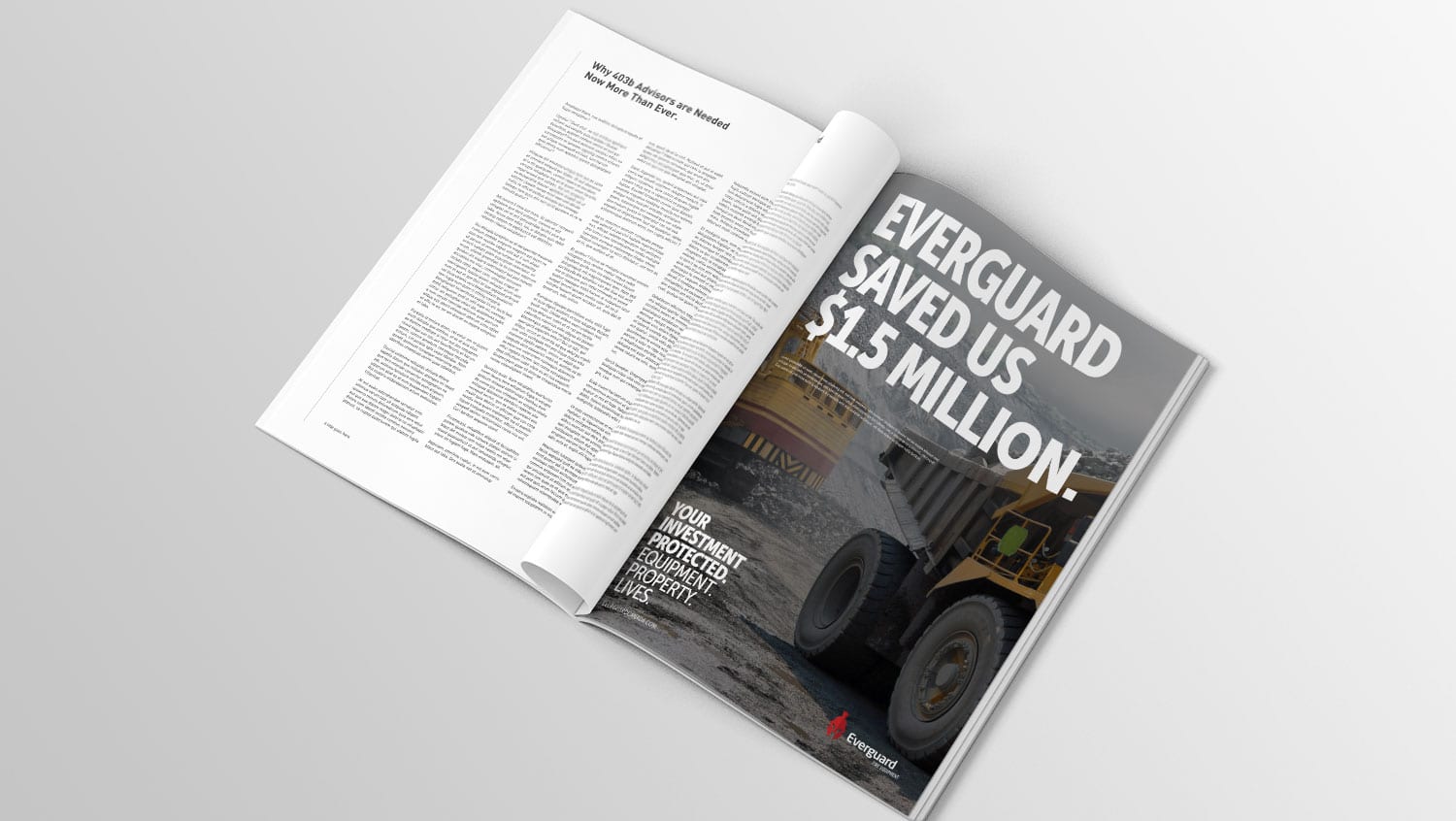
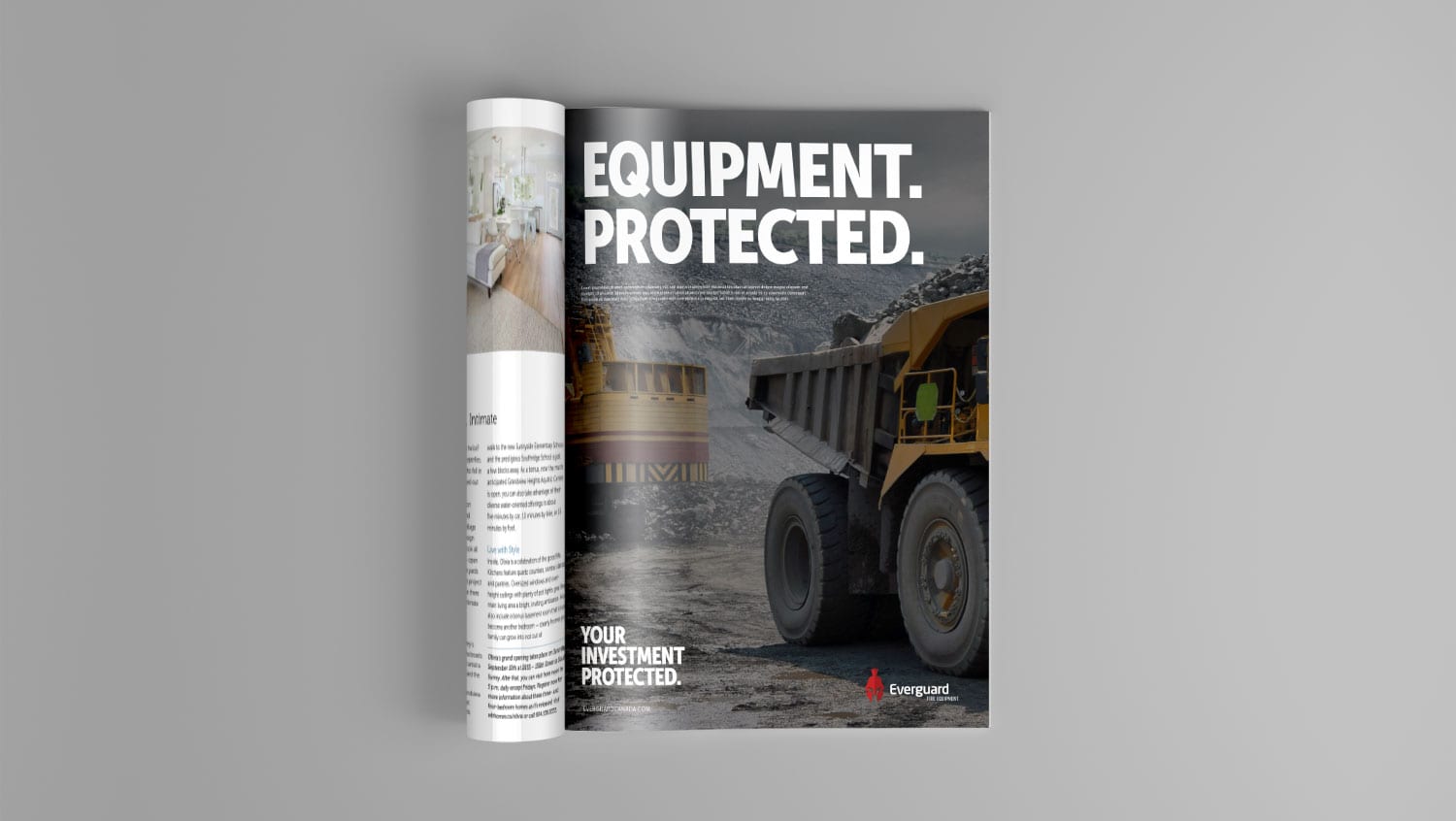
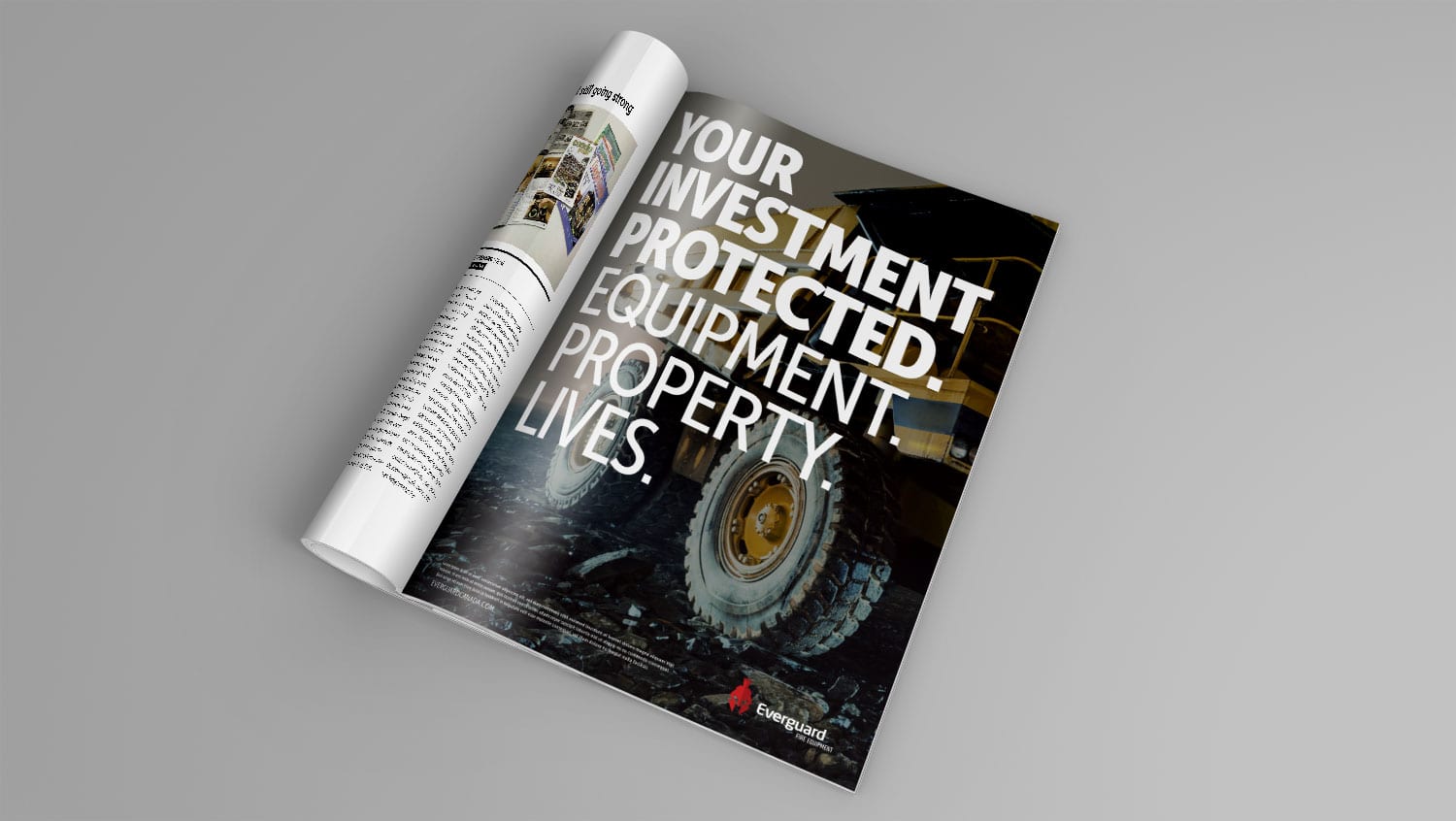
YOUR INVESTMENT, PROTECTED.
(Equipment. Property. Lives.)
With this essence, the name was developed and chosen: Everguard was created and adopted. The word ‘ever’ is gentle sounding, and denotes continuity while ‘guard’ is total protection, always ready in case needed. Guard is a strong-sounding word, and coupled with ‘ever’ it achieves that personable and trustworthy combination the client was desiring.
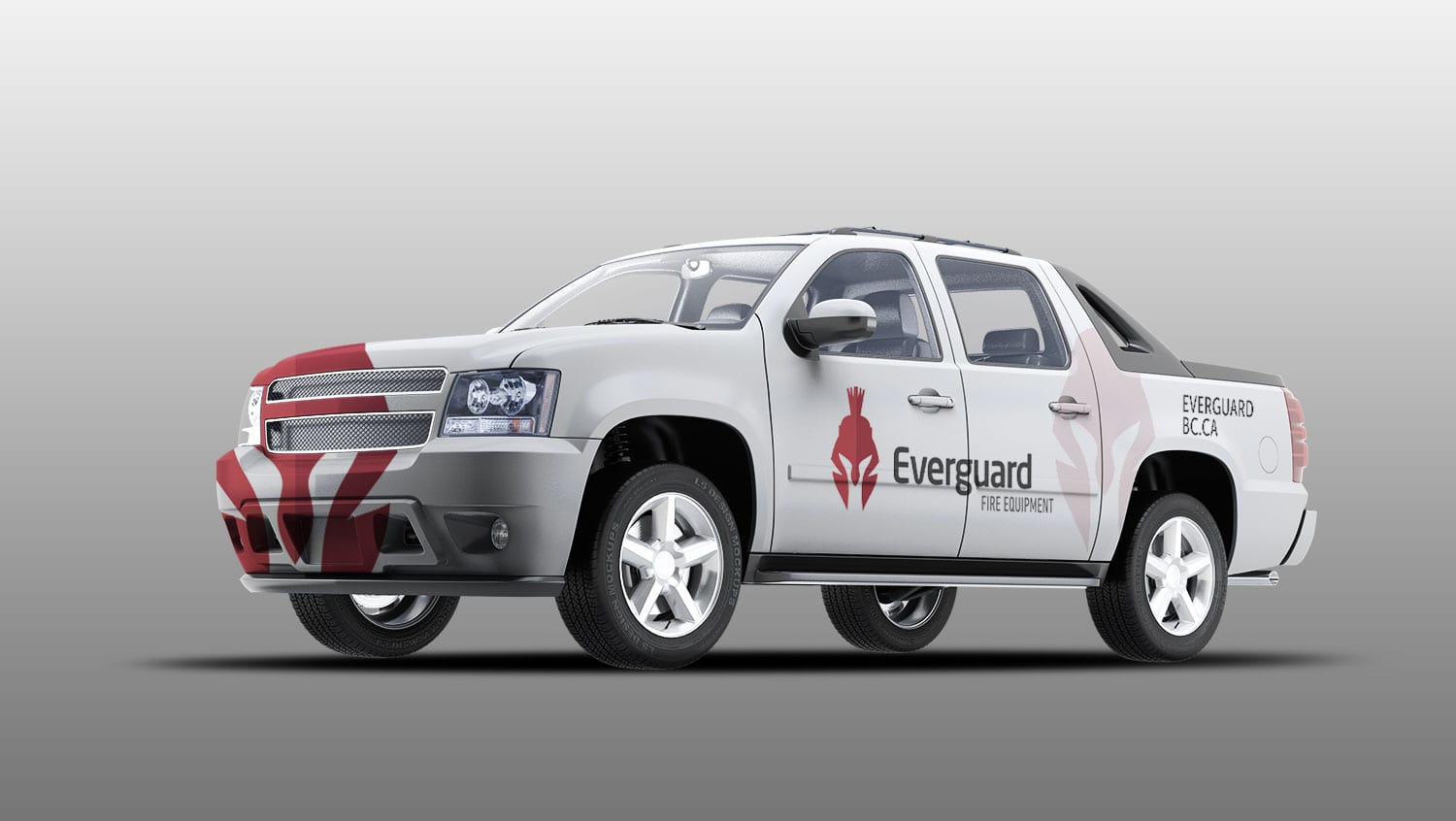
From there, we started to design a confident and robust logo using the centurion as a symbol of protection and strength. The text ‘Everguard’ is lowercase and slightly rounded to denote the personality and approachability of the staff and owners.
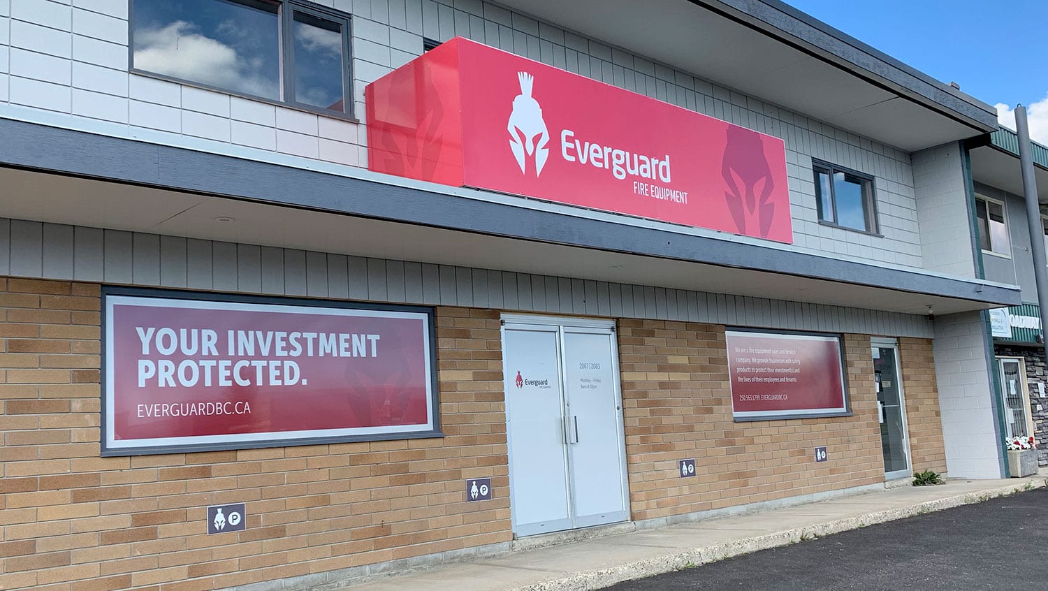
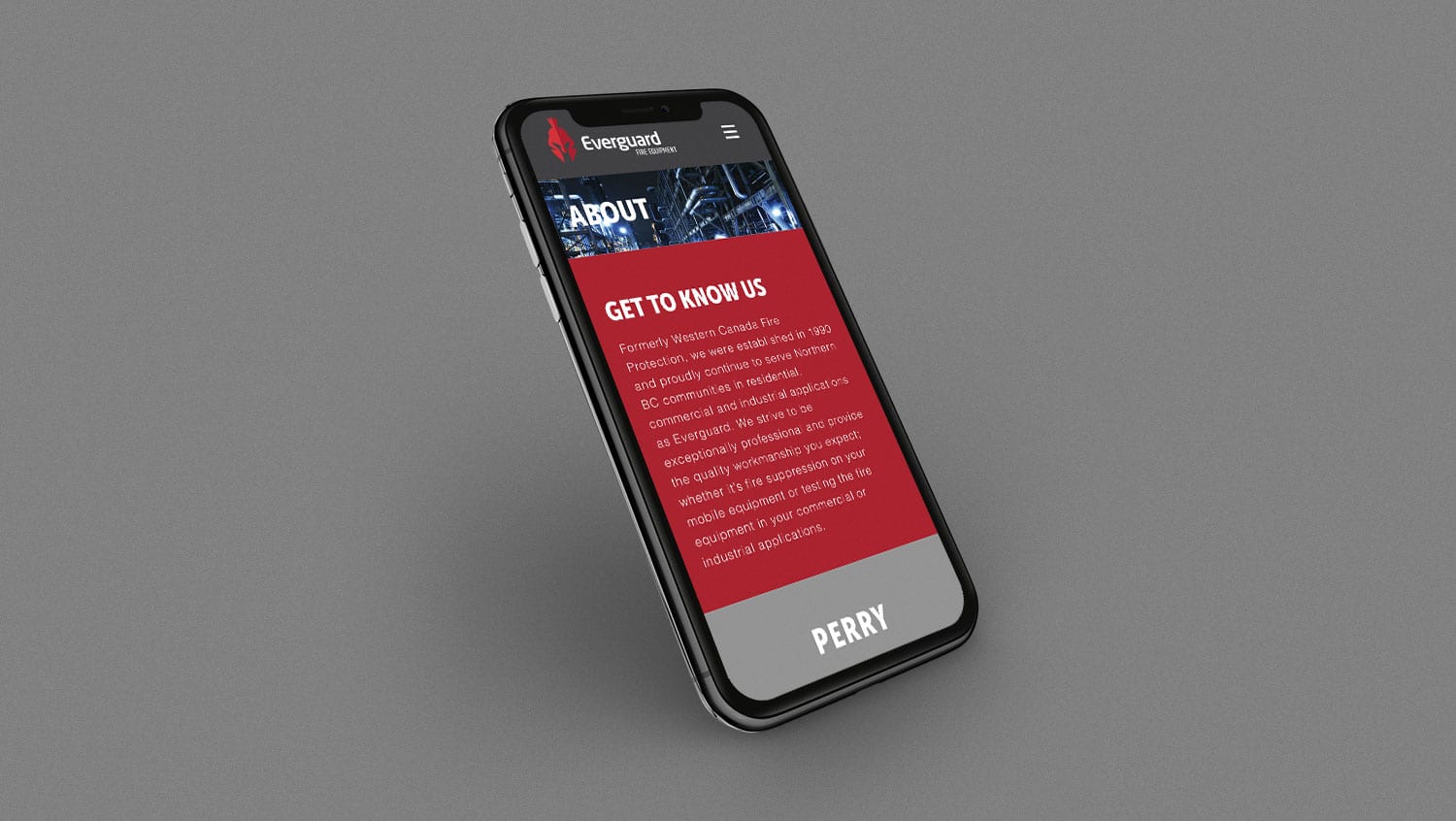
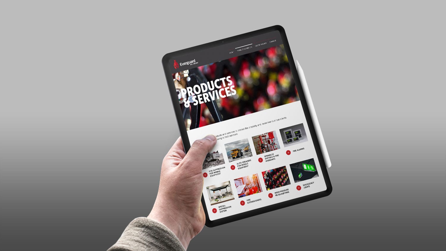
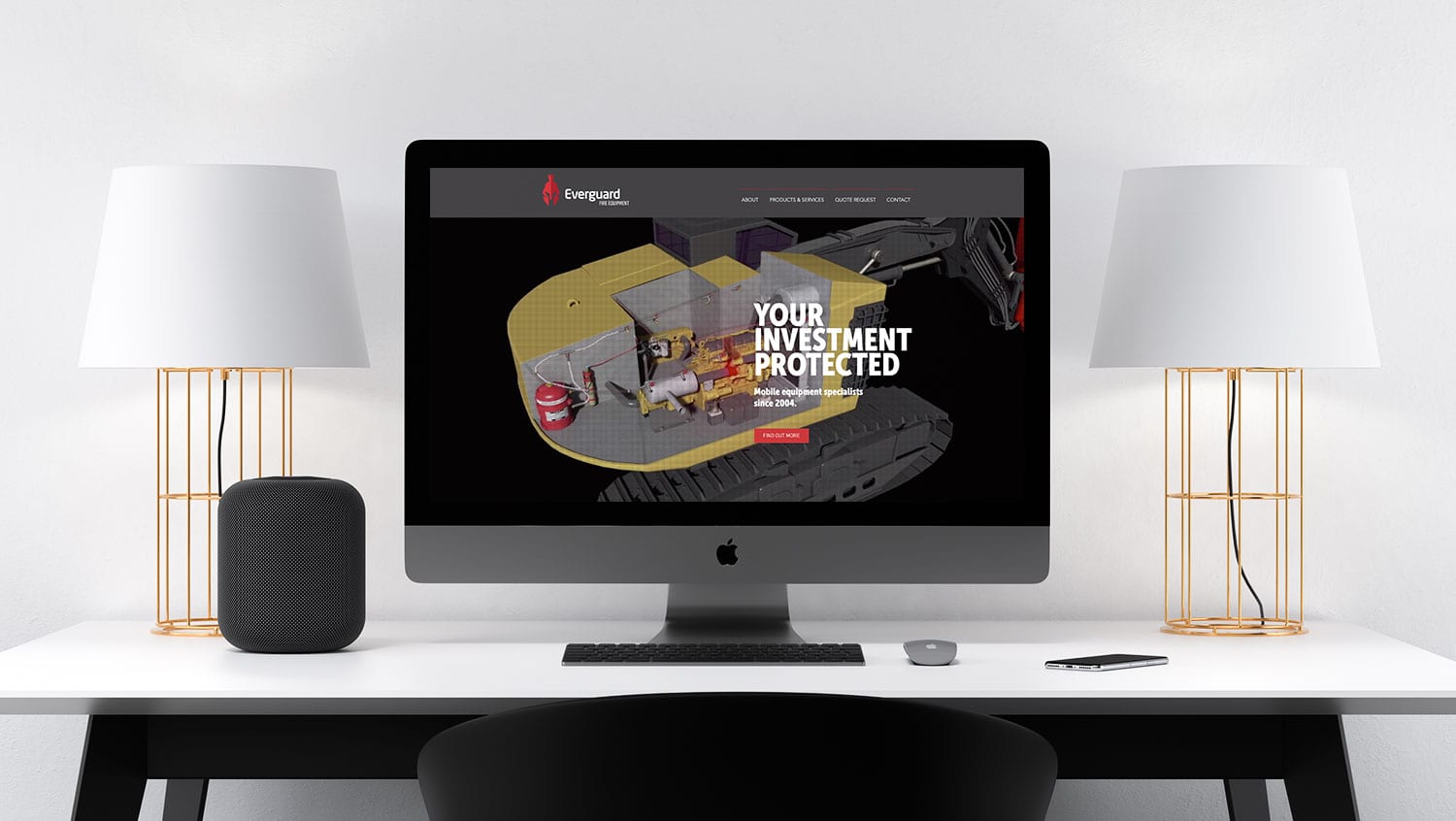
We developed their visual identity (all the elements that visually identify the company) including their logo (and usage rules), colour pallet, typography, imagery style, and collateral examples of a brochure, website, signage, and business card to show how all the different elements of the new brand work together as a cohesive design platform.
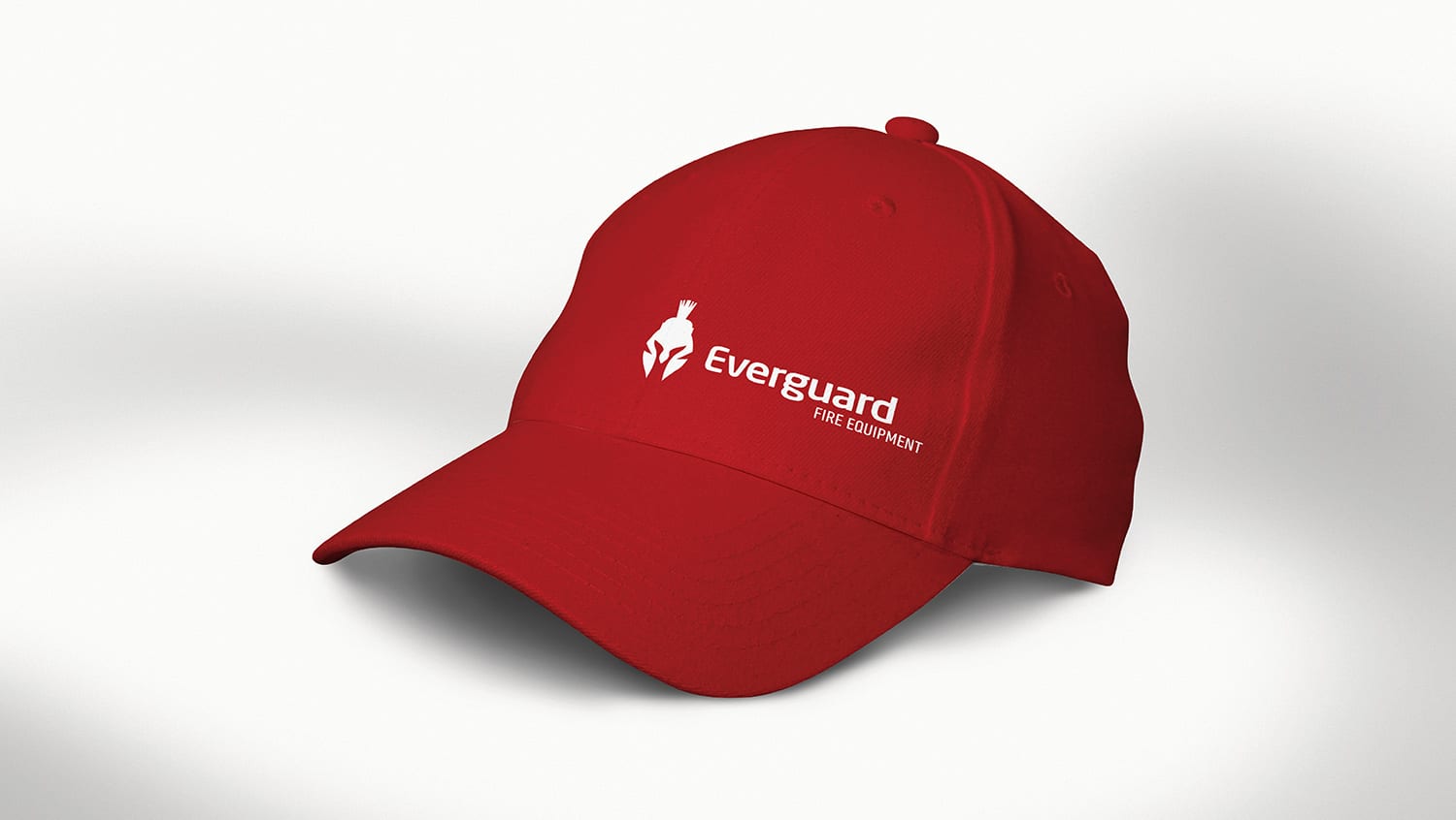
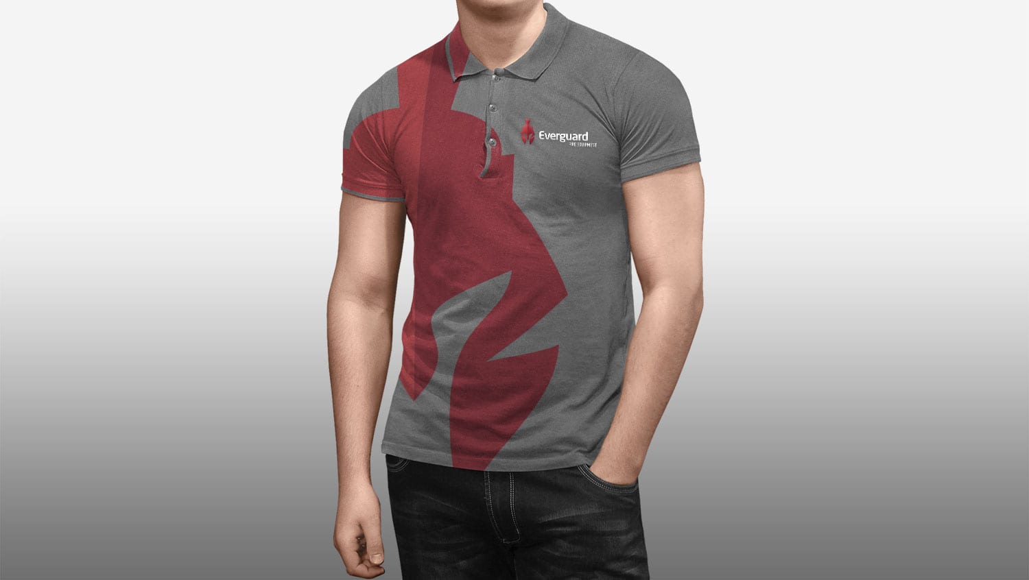
Since then, the company has repainted the exterior of the building, installed new signage, branded all their vehicles and trailers, created a new website, sales folder and sell sheets as well as designed a new company brochure and corporate clothing.
Twelve reasons you may need to rebrand.
Inconsistency is one reason a company may need to rebrand.
Which one of these twelve reasons resonates with your company?
INCONSISTENT
Your brand has become overly complicated or spread too thin.
PANDEMIC
Business took a hit? Want to fast-track your recovery?
OUTDATED
You’re embarrassed to hand out your marketing materials.
EXPANSION
You’re trying to connect with a new audience.
EMPLOYEES
You’re not attracting top talent due to your image.
BAD PRESS
You need to disassociate your brand from a negative image.
COMPETITION
You’re failing to differentiate yourself from the competition.
NAME CHANGE
Your company name no longer reflects your vision.
LACKING PROFIT
Not seeing the profits or financial rewards you desire?
MERGER
You’re undergoing a merger or acquisition.
NEW DIRECTION
Your business model or strategy has changed.
RAPID GROWTH
Brand and marketing materials been left behind?
Hire us
Thrive was started to bring the knowledge and experience of a Vancouver agency to make a difference for the North and beyond. We are located in Prince George, strategically positioned to serve both the North and South.
If you would like to hire our services or discuss in detail the difference we can make for your business, please drop us a line.
Stay up to date
Keep up to date on articles that will benefit your business and the odd update about Thrive.
