As we move into a new year, new trends in terms of website design and colour emerge. Have you ever taken a moment to stop and think about the way colours conjure certain thoughts or emotions within yourself? Perhaps you haven’t, but there are companies and departments within large corporations that dedicate much of their time researching and determining what colour, within their brand, will be the colour of the upcoming year.
Why is this so important? Simply put, colours are very powerful.
It is possible to elicit certain emotions within a person just by choosing the right colour. If we look at primary colours, we can see the emotions those colours tend to evoke:
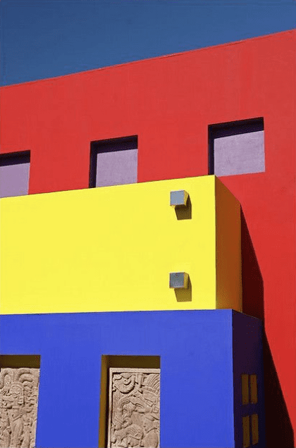
Blue: Calming – peaceful, productive, used in study areas and bedrooms
Red: Stimulating – makes people excited, elicits a response, not easily ignored
Yellow: Stimulating – evokes joy and happiness, elicits a response, too much can cause upset
From those primary colours there are up to 7,000,000 colours and shades that the human eye can see. That can equal a lot of feelings and emotions!
Feelings and emotions are what drives the human race and cause us to act or react. They are the foundation of most of our purchasing decisions.
“95% of our purchasing decisions happen in our subconscious.”
– Professor Gerald Zaltman, Harvard Business School
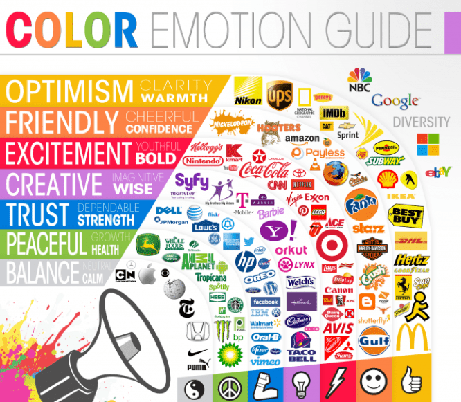
Of course, an important purpose of any brand identity is to cause an emotional connection or to elicit a response. So, depending on your target audience and the response you wish to elicit, colour can be extremely important.
If you have ever been involved with any branding you are likely familiar with the term “Pantone” as it relates to colour.
What exactly is Pantone?
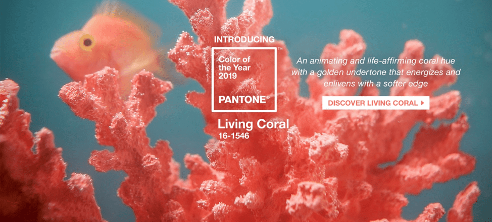
Pantone is known worldwide as the standard language for colour communication by using codes to represent colours, and it is the Pantone Color Institute, in the design world, who elects the upcoming colour of the year.
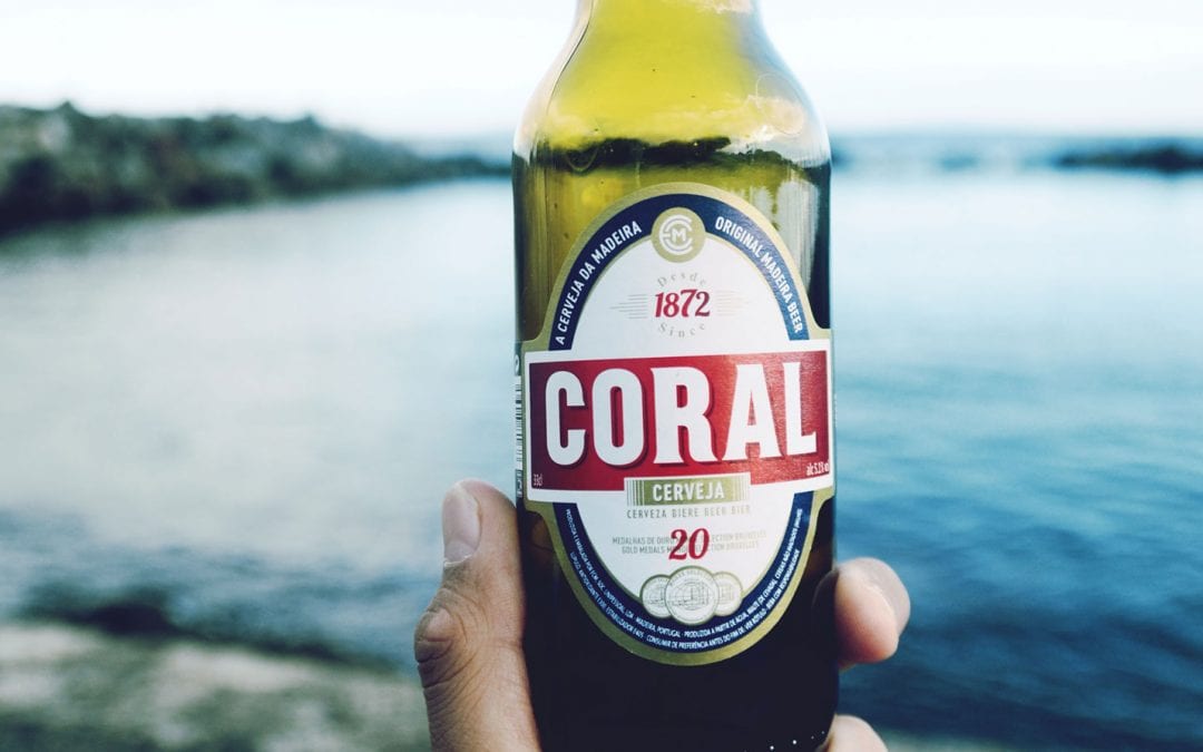
For 2019, Living Coral (Pantone 16-156), has been chosen as the colour of the year.
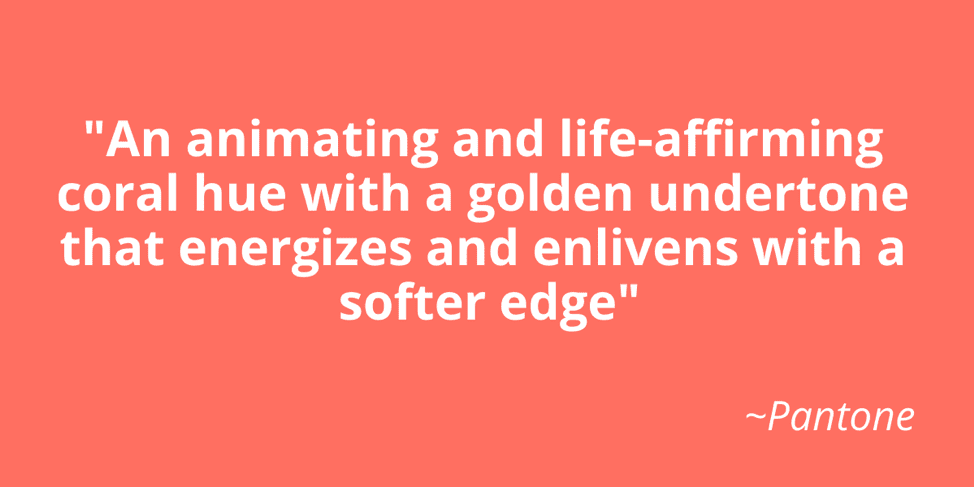
A lot of emotion has been expressed with this colour and of course, that is the goal. According to Leatrice Eiseman of Pantone, “consumers are craving human interaction and social connection” and “Living Coral hit a responsive chord.”
In the world of design, there are others who also decide what colours will be representative of their brand in the upcoming year.
Let’s take paint for example.
The big players such as Behr, Sico, Sherwin Williams, and Benjamin Moore have all decided their own colours of the year.
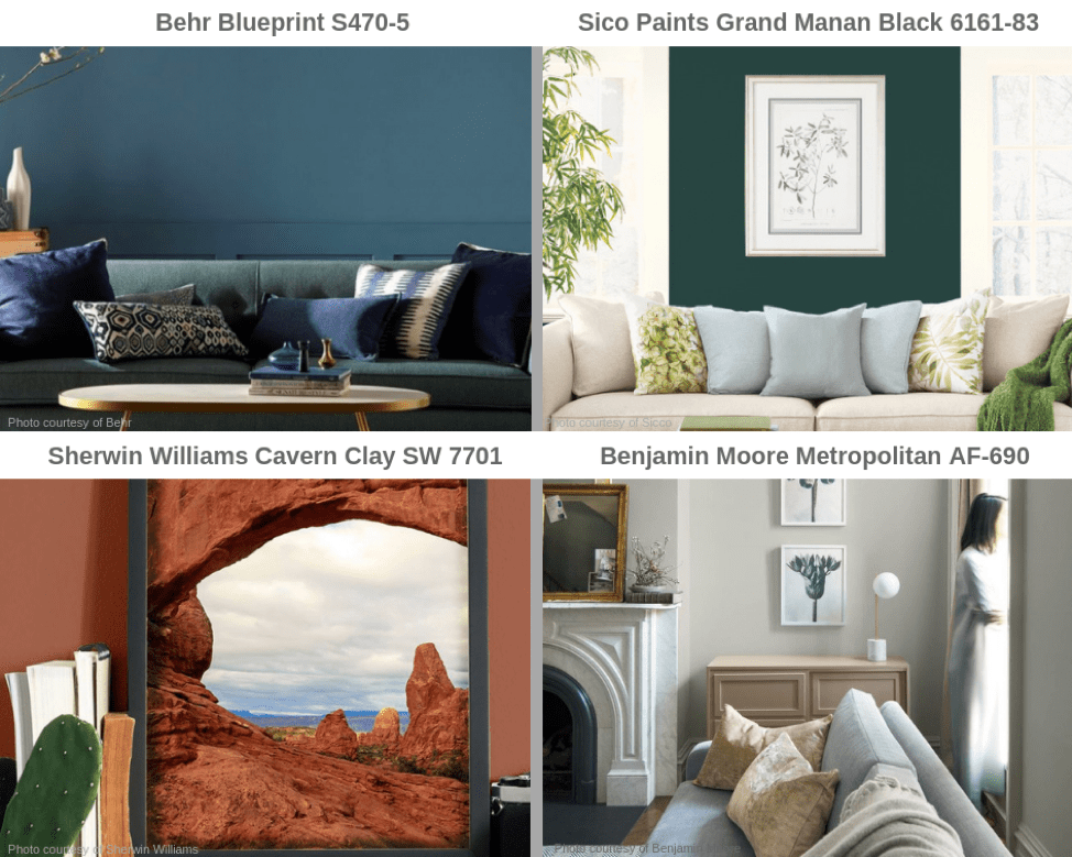
Overall, the feeling of warmth and earthiness is pronounced and is the theme across the board.
So, whether we are referring to colours within the home or as part of your brand identity, it is clear to see that colour is an essential element in creating a feeling that your audience is going to resonate with.